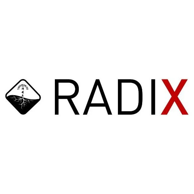
Design Process and Philosophy Behind the ITF Radix Logo
When crafting the ITF Radix logo, we aimed to merge tradition and innovation, encapsulating the essence of ITF Taekwon-Do while introducing a visual identity that resonates with its deep philosophical roots. The ITF Radix project is a collaboration between myself, Roy Rolstad, and my colleague Robert Boer, who conceived the name “ITF Radix.” I had the privilege of designing the logo to reflect the core ideas and philosophy behind our work. Here’s a breakdown of the design process and the meaning behind each element:
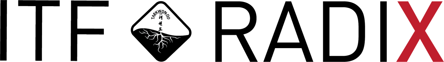
The Foundation: The ITF Tree
We began with the iconic ITF tree, a central emblem found on the back of every ITF dobok. This symbol represents the ITF branch of martial arts, connecting practitioners to the system established by the late Gen. Choi Hong Hi. The tree’s presence in the logo anchors it firmly within ITF tradition and lineage.
Yin-Yang Symbolism
The black and white yin-yang element signifies duality—opposites coexisting in harmony. Specifically, it refers to “heaven and earth,” a concept first introduced in the Chon-Ji Tul pattern. This balance is not just a visual reference but a philosophical reminder to embrace and integrate opposing forces.
The Wave and the Sine Wave
The wave motif symbolizes the sine wave, a defining feature of ITF Taekwon-Do techniques. It reflects the rhythm, flow, and energy inherent in ITF movements, bridging tradition with the physical and dynamic nature of the martial art.
The Roots and “Radix”
The root system beneath the tree is the centerpiece of the logo and represents the very essence of the word “Radix,” which means “root.” Just as the roots provide sustenance and stability to a tree, they symbolize the hidden knowledge and depth of ITF Taekwon-Do that must be uncovered and nurtured.
The roots also highlight the importance of going beyond surface-level understanding—digging deep to explore and truly comprehend the foundation and philosophy of the art.
The Red “X” in Radix
The bold red “X” at the end of “Radix” introduces an element of mystery, representing the unknown. It serves as a reminder of the challenges faced in balancing conservatism and progressiveness within the art. It encourages practitioners to question, explore, and strive for balance, as reflected in the yin-yang philosophy.
Symbolism of Care and Growth
The overall composition suggests that just as a tree thrives with proper nourishment, ITF Taekwon-Do flourishes when its roots—its foundational principles—are honored and nurtured. The light and energy needed for growth are mirrored in the passion and dedication practitioners bring to their journey.
Balancing Tradition and Progress
The logo embodies the challenge of maintaining tradition while embracing innovation. It urges practitioners to honor the roots of ITF Taekwon-Do while remaining open to growth and exploration, striving for balance in every aspect.
Design Execution
• Color Palette: The use of black, white, and red creates a striking contrast, emphasizing tradition (black and white) and passion/energy (red).
• Typography: Clean, modern fonts convey professionalism, while the red “X” injects a sense of boldness and curiosity.
• Form and Composition: The combination of tree, roots, wave, and yin-yang creates a balanced and cohesive design, integrating symbolic depth with visual clarity.
The ITF Radix logo is more than just a visual marker; it is a narrative in itself, reflecting the essence of ITF Taekwon-Do. It speaks to the roots of the martial art, the balance of opposites, and the continuous journey of discovery and growth.
– Roy Rolstad